How to Add Charts to a LinkedIn Carousel
Turn numbers into save-worthy slides. How to add a bar, pie, donut or line chart to a LinkedIn carousel in Reathy - type your data as text, pick a gradient, done.
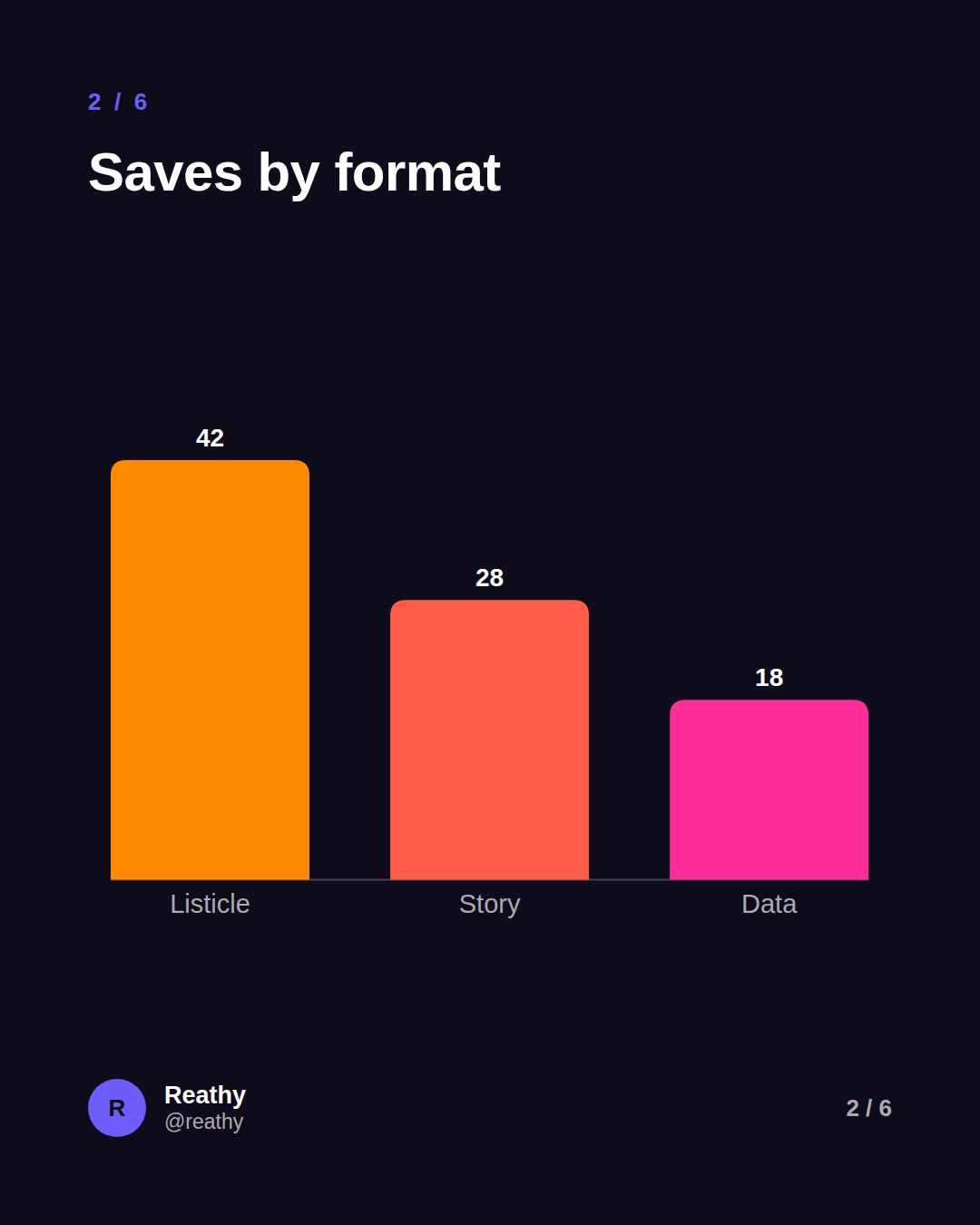
In Reathy, a chart is an object you drop on a slide. Open the Slide tab, pick Bar, Pie, Donut or Line, type your data one line at a time ("Listicle 42"), and choose a colour gradient. The chart renders as crisp vectors that export cleanly in your PDF - no spreadsheet, no screenshotting Excel.
A single clear chart is one of the most save-worthy things you can put in a carousel. A number in a sentence slides past; the same number as a bar someone can see makes them stop, and often screenshot. The problem has always been getting the chart in there - exporting from Excel, wrestling Canva, ending up with a blurry screenshot that doesn't match your slide.
Reathy now makes charts a first-class object. You add one the same way you add a shape, type the data as plain text, pick a gradient, and it's part of the slide - sharp at any size and on-brand by default. Here's how to use it well.
Why a chart earns the save
Carousels are a visual, swipe-through format, and the eye is drawn to shapes before words. A chart does three things a line of text can't: it shows scale (this is twice that), it makes a claim feel evidenced rather than asserted, and it gives the reader something concrete to save for later. If your point is a comparison, a trend, or a breakdown, it almost always lands harder as a chart than as a bullet.
The four chart types - and when to use each
- →Bar - comparing a handful of things: tools, formats, months. The clearest default, and the easiest to read on a phone.
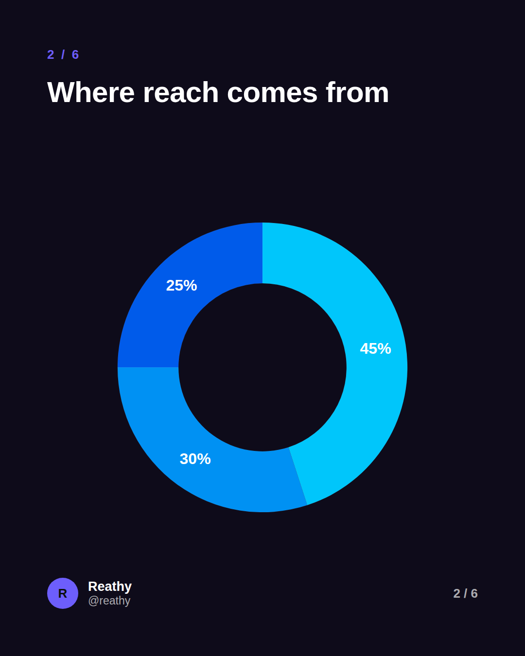
- →Pie - showing parts of one whole where there are only a few slices (three or four). Great for "where X comes from".
- →Donut - the same as a pie, but the hole gives you a calmer, more modern look and room to breathe.
- →Line - a trend over time: growth, before/after, a metric across weeks. Use it when the story is the direction, not the individual values.
How to add a chart in Reathy
It takes about thirty seconds. Everything is text-first, so there's no chart software to learn.
- →Open the Slide tab and, under Charts, click Bar, Pie, Donut or Line. The chart appears on the slide, selected.
- →In the data box, type one item per line as "Label value" - for example "Reathy 42", "Canva 28". The last number on each line is the value; the rest is the label.
- →Pick a colour: a ready-made gradient (Sunset, Ocean, Grape and more), the theme gradient that follows your slide's accent, or a custom two-colour gradient of your own.
- →Drag it where you want it, and use the side handles to size it. Toggle "Show values" if you want the numbers on the chart.
Design tips so the chart reads on a phone
- →One chart per slide. A carousel slide is small; two charts fighting for space means neither gets read.
- →Keep the data short - three to five bars or slices. A chart with twelve tiny bars is a screenshot of a spreadsheet, not a carousel slide.
- →Let the values show. On mobile, a number printed on the bar is easier than making people compare heights by eye.
- →Pick one gradient and let it run across the chart. A tasteful two-colour gradient looks designed; a different bright colour per bar looks like a ransom note.
- →Label plainly. "Q1, Q2, Q3" beats codes only you understand - the reader has three seconds.
Make your first chart slide
If you have a number worth showing - a result, a comparison, a split - it belongs in your next carousel as a chart. Open the editor, drop in a bar chart, type three lines of data, and pick a gradient. That's a save-worthy slide in under a minute.
Frequently asked questions
How do I add a chart to a LinkedIn carousel?
In Reathy, open the Slide tab, choose Bar, Pie, Donut or Line under Charts, then type your data one line at a time as "Label value" (e.g. "Reathy 42"). Pick a gradient, drag it into place, and export - the chart is drawn as vectors, so it stays sharp in the PDF.
What kind of charts can I make?
Bar (vertical), pie, donut and line charts. Bar is best for comparing a few items, pie and donut for parts of a whole, and line for a trend over time.
Do I need a spreadsheet or design tool?
No. You type the data as plain text lines inside the editor - one label and value per line - and Reathy draws and colours the chart for you. There's nothing to import and no screenshot of Excel to clean up.
Can I match the chart to my brand colours?
Yes. Charts default to a gradient built from your slide's accent colour, and you can pick from ready-made gradient palettes or set your own two-colour gradient. The colours carry across every slide for a consistent look.
Make your carousel now
Free to start - 5 slides per carousel and 20 exports a month. No design skills needed.
Open the editor