LinkedIn Carousel Best Practices: What Actually Gets Saves
The best practices that decide whether a LinkedIn carousel gets read and saved - a strong cover, one idea per slide, mobile-first design and a single clear CTA. With examples and the common mistakes to skip.
The best carousels do four things well: the cover earns the swipe, every slide carries one idea, the design is readable on a phone, and the last slide makes one clear ask. Almost everything else is detail. Nail the cover and keep one idea per slide and you are ahead of most of the feed.
A LinkedIn carousel is a small, strict format. You have a few seconds on the cover to earn a swipe, a handful of slides to deliver, and one slide to ask for something. That constraint is good news: the things that make a carousel work are few and repeatable, so you can turn them into a checklist and stop guessing.
This guide is the short list of what actually moves the needle, in rough order of impact. It is the capstone of our other guides - each section links to the deeper one when you want it.
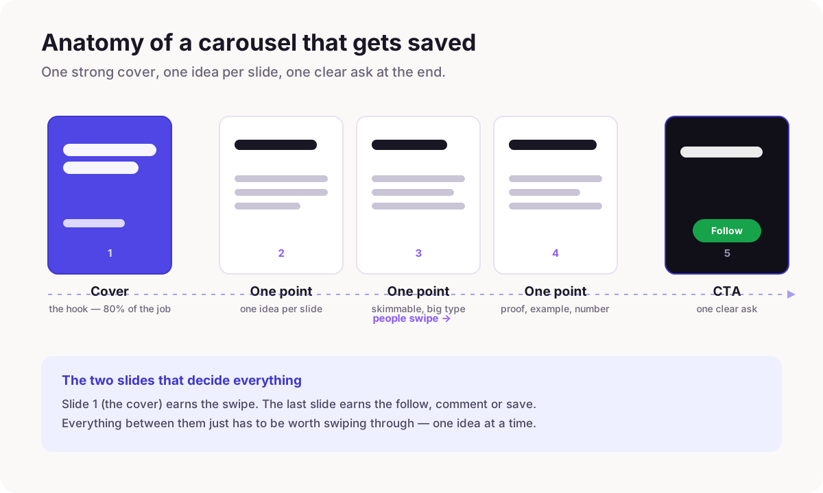
1. The cover is 80% of the job
Nobody saves a carousel they never opened. The cover is the only slide most people see, so it has one job: make the scroll stop and the thumb swipe. Lead with a specific promise or a real tension - a number, a mistake, a before/after - not a vague topic label. "5 hooks that doubled my saves" beats "Thoughts on hooks."
Keep the cover almost empty. One big line, maybe a second smaller one, and enough contrast that it is legible at thumbnail size. If your cover needs three sentences to make sense, the promise is not sharp enough yet.
2. One idea per slide
The most common reason a carousel feels tiring is that each slide is doing too much. Give every slide exactly one idea and one supporting line. If a slide has two points, it is two slides. This is what makes a carousel skimmable - people swipe fast, catch the big line on each slide, and only slow down where something lands.
Write the big line so it stands on its own. Someone should be able to read only the headlines across all slides and still get the whole argument. The body text is for the people who stopped.
3. Design for a thumb on a phone
Most of your audience is on mobile, holding the phone one-handed, half-paying-attention. That has direct consequences: use portrait 4:5 so each slide fills more of the feed, set type large enough to read without zooming, and keep high contrast between text and background. Thin grey text on white is invisible on a sunny commute.
Consistency also reads as quality. Same font, same margins, same accent colour on every slide - it signals that the whole thing is worth trusting. This is exactly the part a text-first tool handles for you, so you are not eyeballing alignment slide by slide.
4. End with one clear ask
The last slide is where a passive reader becomes a follower, a comment or a save - but only if you ask for one thing. "Follow for a new one each week," "Save this for your next post," or "What would you add? Comment below." Pick one. A slide that asks for a follow and a comment and a share and a website visit gets none of them.
Make the ask match your goal. If you are building an audience, ask for the follow. If you want reach, ask for a comment, because comments pull a post back into the feed.
5. Make it as long as it needs to be - and no longer
There is no magic slide count. Six to ten slides is a comfortable range for most points: enough to develop an idea, short enough that people finish. Go longer only when the topic genuinely earns it, and never pad to hit a number - a tight seven-slide carousel beats a bloated twelve every time. If you are cutting to fit, cut the weakest middle slide, never the cover or the CTA.
6. The post around the carousel matters as much as the slides
The carousel is the PDF; the caption is what makes anyone open it. The first line of your post is the only text LinkedIn shows before "see more," so it has to hook just like the cover does. Then post when your audience is actually online. These two things are quietly responsible for a lot of the difference between carousels that flop and identical ones that fly.
What good looks like
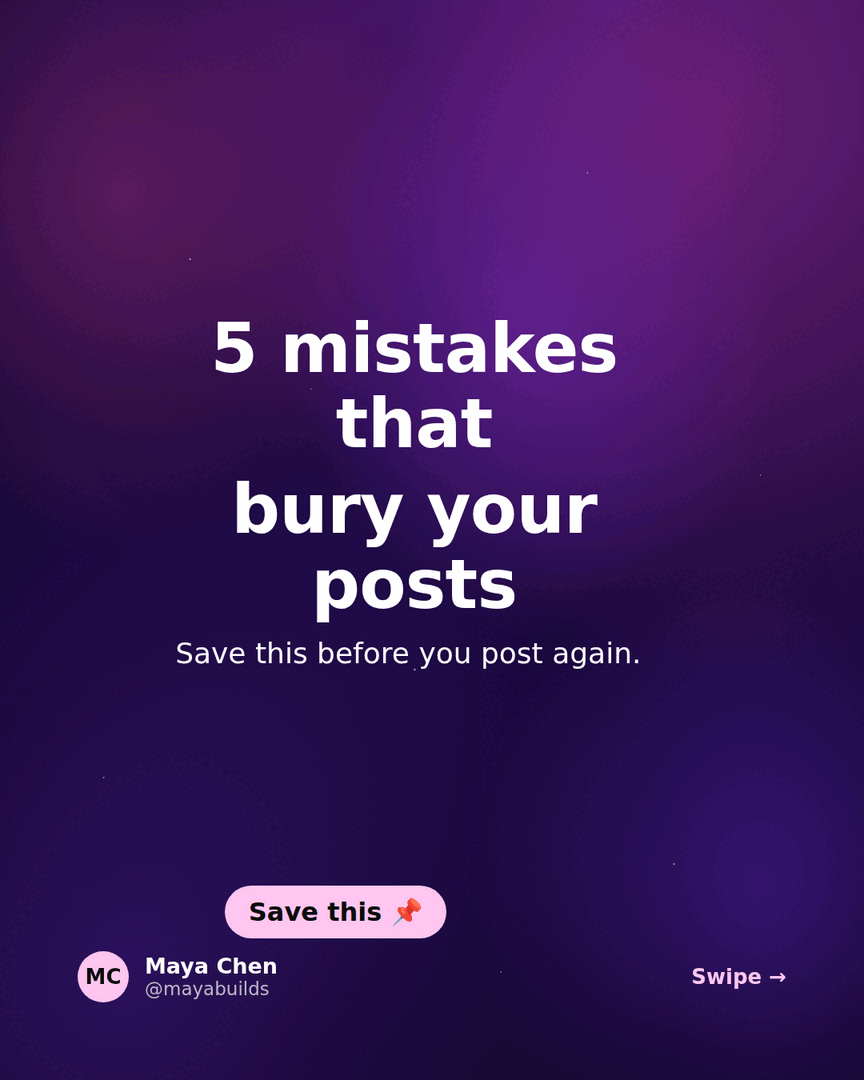
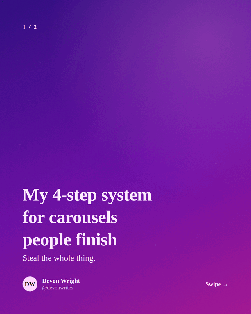
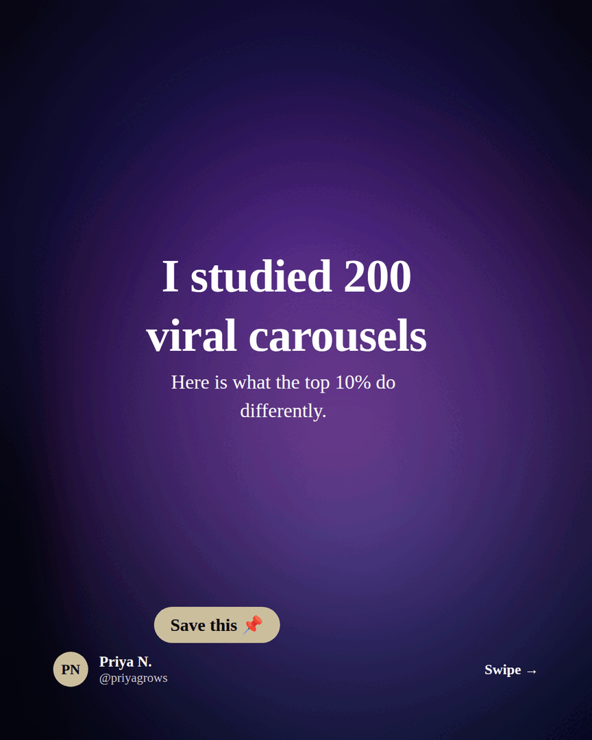
These are real carousels built in Reathy - notice how each cover makes a single, specific promise and each inside slide carries one idea.
Common mistakes to skip
- →A vague cover. "Some lessons on leadership" is not a promise. Say which lessons and what they get.
- →Two ideas on one slide. Split it. Crowding is what makes people bail.
- →Tiny, low-contrast text. If it is not readable at arm's length on a phone, it does not exist.
- →No CTA, or five CTAs. Ask for exactly one thing on the last slide.
- →A great carousel with a lazy first line in the post. The best slides never get opened if the caption does not hook.
- →Inconsistent styling slide to slide. Pick one theme and let it carry across every slide.
The fastest way to apply all of this
You do not have to hold this checklist in your head. Reathy is built around it: you write one idea per slide as plain text, pick a theme that keeps type large and consistent, and export a portrait PDF that is already the right size. Start from a template if you want the structure pre-built.
Frequently asked questions
How many slides should a LinkedIn carousel have?
Six to ten works for most topics - long enough to develop one idea, short enough that people finish. There is no algorithmic sweet spot; a tight seven-slide carousel beats a padded twelve. Only go longer when the topic genuinely needs it.
What makes a LinkedIn carousel get more engagement?
In order of impact: a cover that makes a specific promise, one idea per slide so it stays skimmable, large high-contrast text for mobile, and a single clear call to action on the last slide. A strong first line in the post itself and posting when your audience is online do the rest.
What size should a LinkedIn carousel be?
Portrait 4:5 (1080 x 1350 px) is the best default because it takes up the most feed space on mobile. Square 1:1 also works. Export the whole carousel as a single PDF and upload it as a document post. The size and specs guide has the full details.
Do carousels still work on LinkedIn?
Yes. Document posts (which is what a carousel is) remain one of the highest-dwell-time formats on LinkedIn because they make people swipe, and dwell time is a strong signal. The format rewards a clear promise and one idea per slide more than any trick.
Make your carousel now
Free to start - 5 slides per carousel and 20 exports a month. No design skills needed.
Open the editor