12 LinkedIn Carousel Examples for 2026 (With Breakdowns)
Real LinkedIn carousel examples across the formats that earn saves - list, framework, data drop, story, checklist and hot take - each with why it works.
The best LinkedIn carousel examples fall into six repeatable formats: the numbered list, the step-by-step framework, the data drop, the personal story, the checklist and the contrarian take. Each opens with a specific cover promise, keeps one idea per slide, and ends with a clear call to action. Below are real two-slide examples of each - built in Reathy with premium themes - and a version you can recreate in a click.
The fastest way to get better at carousels is to stop staring at a blank slide and start from a format that already works. Below are six carousel examples - all built in Reathy, all following a structure you can reuse this week. For each you'll see the cover and the slide that follows it, why the format works, and the theme, layout and touches used to design it. Steal the shape; drop in your own expertise.
One thing every example shares: the cover does the heavy lifting. It names a specific payoff, keeps the headline huge, and adds a small swipe cue or call-to-action pill. Get the cover right and people actually see slide two onward. Every design here was made from a few lines of text plus a theme - no design tool involved.
1. The numbered list
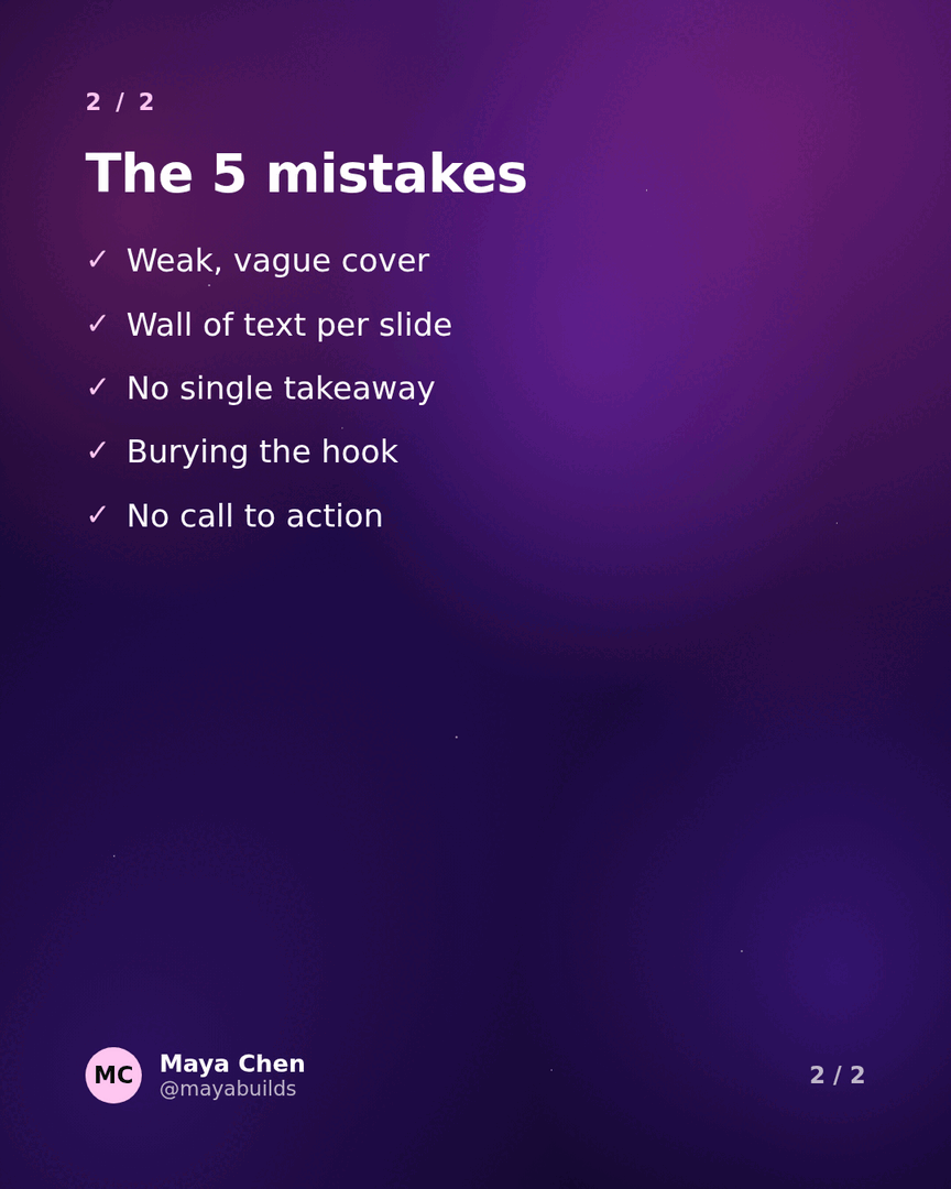
The workhorse of LinkedIn carousels. A number sets expectations (readers know exactly how long the payoff is), and framing it around a mistake or a cost adds a little tension that earns the tap. Inside, it's one item per slide - here the second slide uses the checklist layout so each mistake reads as a tickable point.
- →Best for: tips, mistakes, lessons, tools - anything you can itemise.
- →Cover pattern: "[Number] [things] that [payoff or consequence]."
- →Made with: Nebula theme, Hero + Checklist layouts, and a "Save this" CTA pill.

2. The step-by-step framework
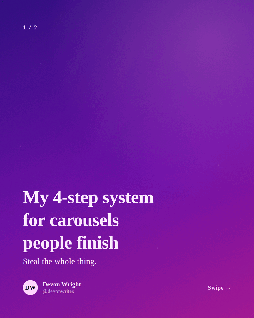
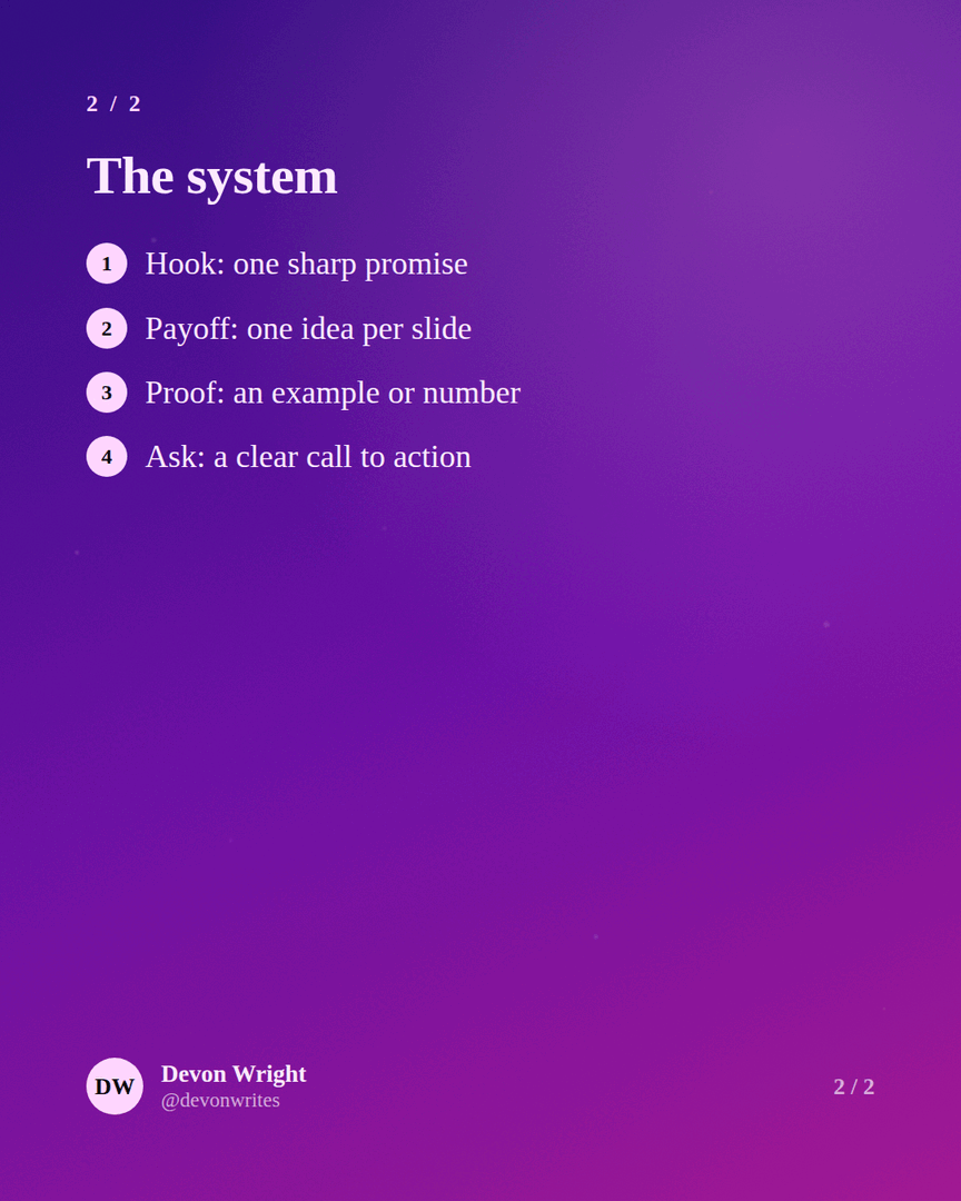
Frameworks travel. When you name your process - "my 4-step system" - it becomes a thing people can remember, screenshot and credit you for. The cover promises a whole method; the numbered layout on slide two delivers one step at a time so nobody gets lost.
- →Best for: processes, playbooks, anything you do the same way each time.
- →Cover pattern: "My [N]-step [system/framework] for [outcome]."
- →Made with: Velvet theme, Caption + Numbered layouts.
3. The data drop
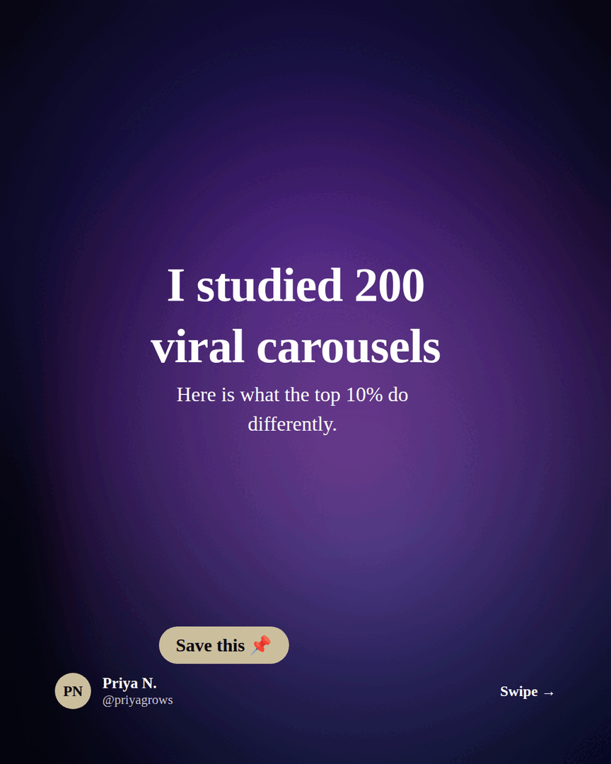
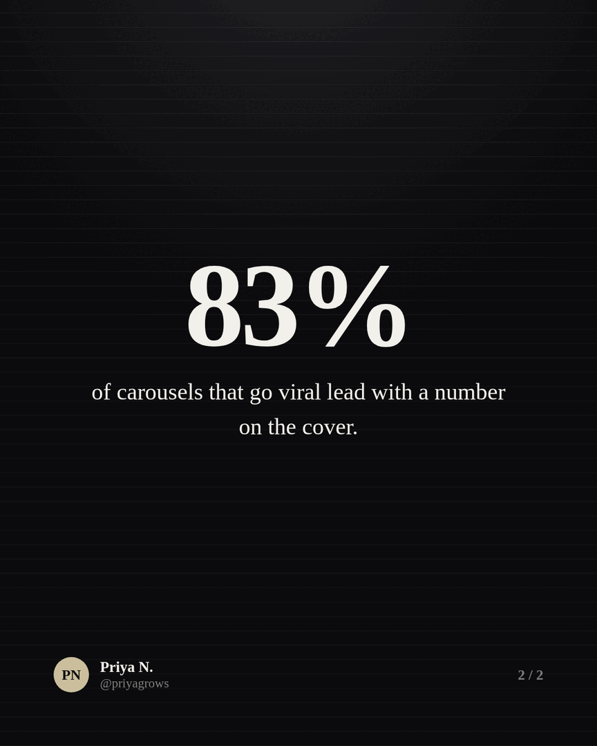
Original numbers stop the scroll because nobody else has them. You don't need a research budget - "I studied 200 posts," "I sent 500 cold emails," "I reviewed 200 resumes" all count. The cover leads with the effort over a background image; the big-number layout on slide two makes the headline stat impossible to miss.
- →Best for: teardowns, experiments, anything where you did the legwork.
- →Cover pattern: "I [analysed/tested/reviewed] [big number] [things]. Here's what I learned."
- →Made with: Onyx theme, a background image on the cover, and the Big number layout.
4. The personal story
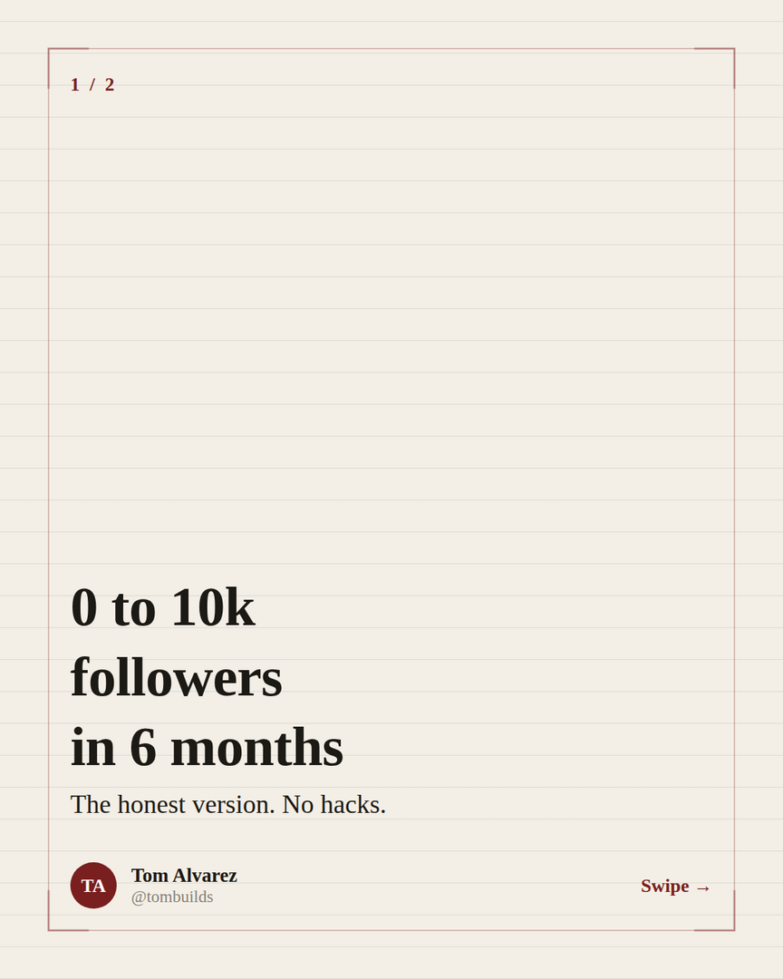
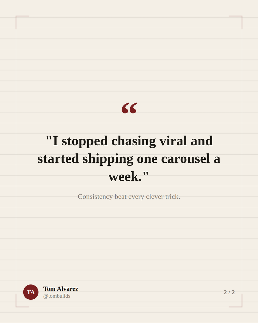
Stories are the format people finish, because a good arc pulls you to the last slide. The trick is a specific, believable transformation and an honest tone - "the honest version, no hacks" outperforms hype every time. The editorial theme and a quote layout give it a calm, credible feel: setup, turn, lesson.
- →Best for: origin stories, lessons learned, a win or a failure with a takeaway.
- →Cover pattern: "[Starting point] to [result] in [timeframe]."
- →Made with: Broadsheet theme, Caption + Quote layouts.
5. The checklist
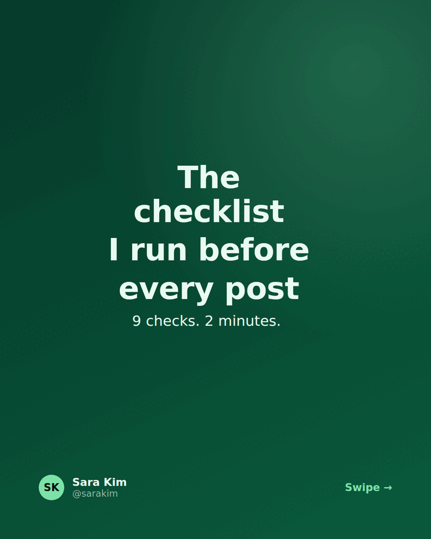
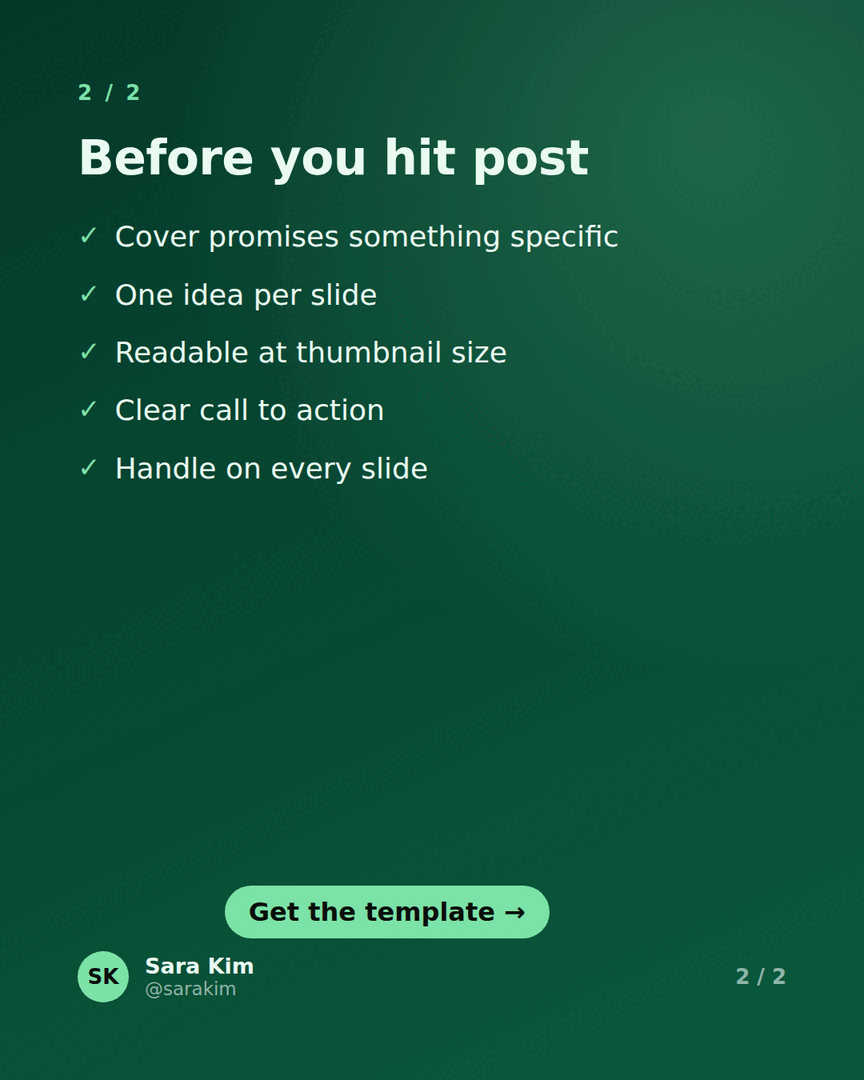
Checklists get saved, and saves are the signal LinkedIn rewards. The reason: a checklist is useful again next week, so people keep it. Naming the count and the time cost ("9 checks, 2 minutes") makes it feel light and worth bookmarking - and a CTA pill on the last slide turns that save into a follow.
- →Best for: pre-flight routines, audits, "before you ship/publish/launch" lists.
- →Cover pattern: "The [N]-point checklist I run before [thing]."
- →Made with: Emerald theme, Hero + Checklist layouts, and a "Get the template" CTA pill.
6. The contrarian take
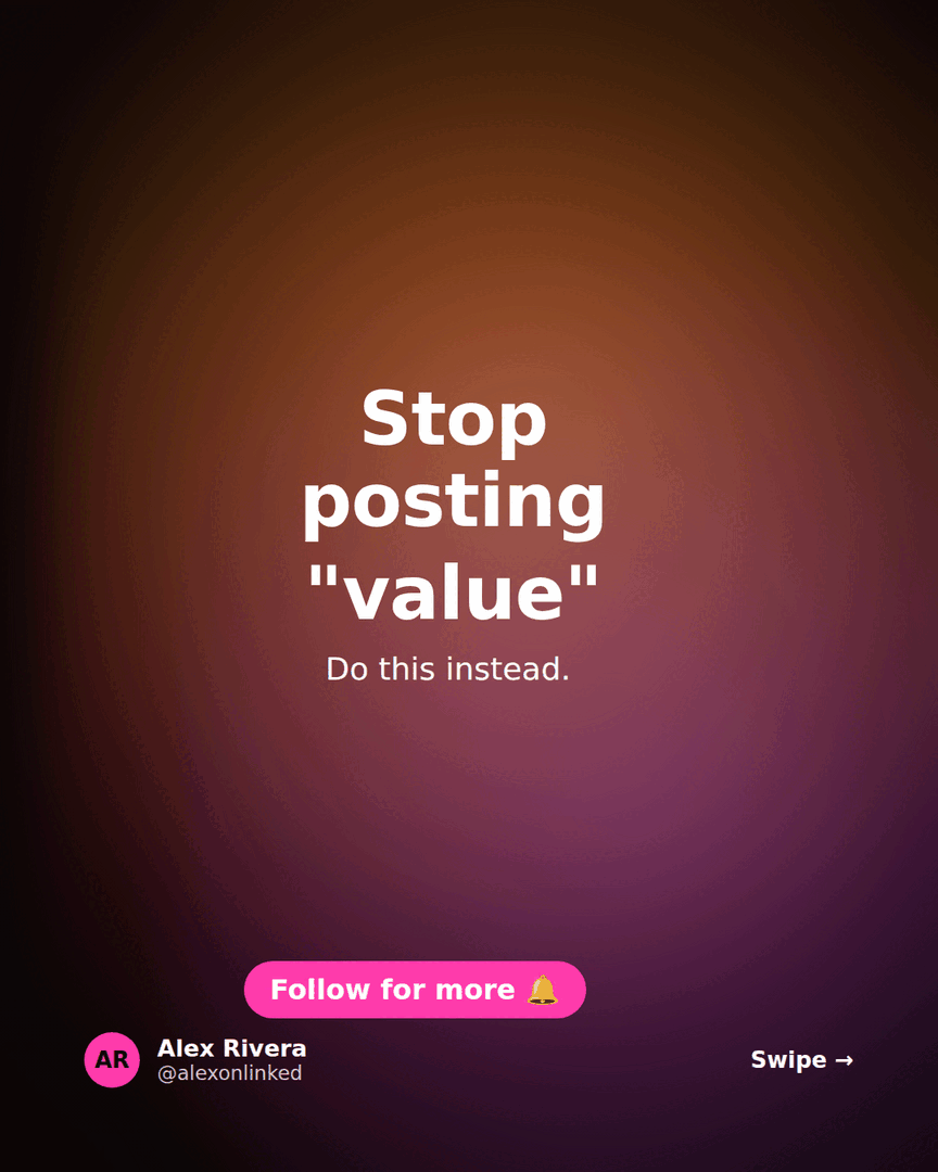
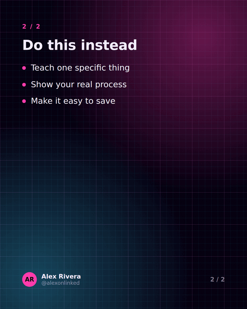
A take against the grain earns attention and comments - as long as you can back it up slide by slide. The cover is a pattern interrupt ("stop doing the thing everyone recommends") set over a bold background image; slide two makes the argument and lands on what to do instead. Use this one sparingly and only when you genuinely believe it.
- →Best for: myth-busting, strong opinions, reframing common advice.
- →Cover pattern: "Stop [common advice]. Do [your alternative] instead."
- →Made with: Neon theme, a background image on the cover, and a "Follow for more" CTA pill.
How to use these examples
Don't copy the words - copy the shape. Pick the format that fits what you know, reuse the cover pattern, then fill the slides with your own specifics. Every design above is just a few lines of text plus a theme in Reathy - the premium themes, per-slide layouts (big number, quote, checklist, numbered), CTA pills and background images you see here are all a click each, so recreating one and swapping in your content takes a couple of minutes.
If you're not sure which format to start with, the numbered list is the safest first carousel: it's the easiest to write and the most forgiving to design.
Frequently asked questions
What makes a good LinkedIn carousel example?
A specific cover promise, one idea per slide with plenty of white space, and a clear call to action at the end. The strongest examples follow a repeatable format - a list, framework, data drop, story, checklist or contrarian take - rather than trying to be clever from scratch.
Can I recreate these carousel examples myself?
Yes. Every example on this page was built in Reathy from a few lines of text and a theme. Pick the format that fits your idea, reuse the cover pattern, and swap in your own content - it takes a couple of minutes and the design is handled for you.
How many slides do these examples use?
Most sit in the 6-12 slide range: a cover, a handful of one-idea slides, and a call-to-action slide. That's long enough to teach one thing and short enough that people reach the end.
Make your carousel now
Free to start - 5 slides per carousel and 20 exports a month. No design skills needed.
Open the editor