LinkedIn Carousel Size & Specs: The Complete 2026 Guide
The exact LinkedIn carousel size, aspect ratio, PDF specs, page limits and slide count for 2026 - portrait vs square, plus a copy-ready cheat sheet.
The best LinkedIn carousel size is portrait 4:5 at 1080 × 1350 px, or square 1:1 at 1080 × 1080 px. Build every slide at the same ratio, export the whole set as one PDF (a document post), keep it under ~100 MB, aim for 6-12 slides, and render at 2× so the text stays crisp in the feed.
Size is one of those things nobody notices when you get it right and everybody notices when you get it wrong. Nail it and your carousel looks sharp and fills the feed; miss it and LinkedIn crops your slides or renders your text soft and fuzzy. The good news: there are only two sizes worth using, and once you know them you never have to think about this again.
Here's everything that actually matters for 2026 - the size, the aspect ratio, the PDF specs, how many slides to use, and how organic carousels differ from paid carousel ads. There's a copy-ready cheat sheet at the bottom.
Best LinkedIn carousel size
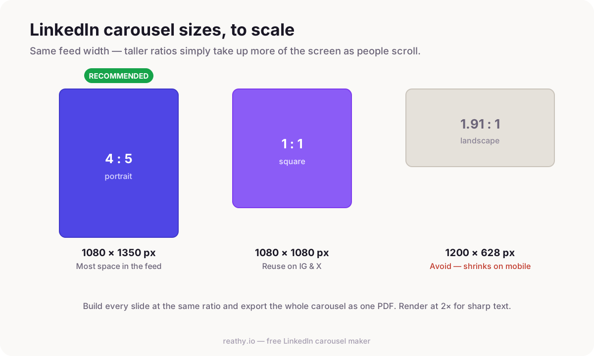
Use 1080 × 1350 px (portrait, 4:5). That's the size we recommend for almost every carousel, because it takes up the most vertical space allowed in the LinkedIn feed - so your post is physically bigger on the screen as someone scrolls, and bigger means more attention.
The only other size worth using is 1080 × 1080 px (square, 1:1). It's a touch smaller in the feed but endlessly reusable: the same square slides drop straight onto Instagram and X without re-cropping. Whichever you pick, the golden rule is that every slide uses the same ratio - mixing portrait and square in one document is what causes those ugly mid-swipe jumps.
Best aspect ratio for LinkedIn carousels
Aspect ratio is just the shape of the slide, and for LinkedIn there are two answers:
- →4:5 (portrait) - the best ratio for reach. Tallest footprint the feed allows, so it's the default for content you're posting to grow.
- →1:1 (square) - the best ratio for reuse. Slightly less feed real estate, but perfect if the same slides need to live on Instagram or X too.
- →Avoid 16:9 and other landscape ratios - they shrink to a thin strip in the feed and your text becomes unreadable on mobile, where most people are scrolling.
Portrait vs square LinkedIn carousel
If you only ever remember one thing: portrait for reach, square for reuse. Portrait 4:5 wins on LinkedIn itself because it's larger in the feed. Square 1:1 wins when a single design has to work across several platforms, or when your layout is naturally centered and doesn't need the extra height. There's no wrong answer - just be consistent within a single carousel.
LinkedIn carousel PDF specifications
A LinkedIn carousel isn't really a "carousel" feature - it's a document post, and the file you upload is a single PDF. Readers swipe through the PDF pages as if they were slides. Here's what that PDF should look like:
- →Format: one multi-page PDF (each page is one slide). Not separate images - a single document.
- →Page size: keep every page identical - 1080 × 1350 px or 1080 × 1080 px.
- →File size: LinkedIn's document upload accepts large files, but keep yours comfortably under ~100 MB. Text-based slides are tiny, so you'll only get close if you pack in full-bleed photos.
- →Pages: LinkedIn's document upload supports a high page count (into the hundreds), but that's a ceiling, not a target - see the slide-count section below.
- →Resolution: export at 2× the display size so type stays crisp on high-DPI phones and laptops. Soft, blurry text is almost always an export-scale problem, not a design one.
Platform limits like maximum pages and file size do get revised over time, so if you're uploading something unusually large it's worth a 10-second check against LinkedIn's own Help Center before you post.
How many slides should a LinkedIn carousel have?
The technical limit runs into the hundreds of pages. The practical sweet spot is 6-12 slides. That's long enough to actually teach one idea - a cover, a few points, a recap, a call to action - and short enough that people reach the end. Past a dozen slides, completion rates fall off a cliff and the algorithm sees people bailing halfway.
If your idea genuinely needs 20 slides, it's usually two carousels, not one. Split it and you get two posts out of the same work.
LinkedIn carousel ad specs (sponsored carousels)
Paid carousel ads are a different format from the organic document posts above, and people mix the two up constantly. If you're running a sponsored carousel through Campaign Manager, the specs to know are:
- →Shape: square 1:1 (1080 × 1080 px) is standard for carousel ad cards.
- →Cards: between 2 and 10 cards per carousel ad.
- →Card format: each card is an individual image (JPG or PNG), not a single merged PDF like an organic document post.
- →Headline copy: keep each card's headline tight - roughly 45 characters before it truncates - and the intro text short so it doesn't get cut in the feed.
So: organic carousel = one portrait PDF you upload yourself; carousel ad = up to ten square image cards you run through Campaign Manager. Most creators want the organic version, which is what the rest of Reathy is built around.
Design settings that read well in the feed
Right size, wrong design still loses. A few habits keep carousels legible at thumbnail size:
- →Big type - your cover title should be readable as a thumbnail. If you have to squint at it small, it's too small.
- →One idea per slide - crowded slides lose people mid-swipe.
- →High contrast - dark text on light, or light text on a dark or darkened-photo background.
- →Consistent branding - the same theme, handle and colors on every slide so people recognize you next time.
The fastest way to hit every spec
You could set up 1080 × 1350 artboards by hand in a design tool and remember to export at 2× every time. Or you can skip all of it: Reathy ships with the portrait and square presets built in and exports a single, sharp, correctly-sized PDF automatically. You pick a format, write your slides, and the specs on this page are handled for you.
Frequently asked questions
What is the best size for a LinkedIn carousel?
Portrait 4:5 at 1080 × 1350 px is the best default - it takes up the most vertical space in the feed, so your post is bigger as people scroll. Square 1:1 at 1080 × 1080 px is a versatile alternative that reuses cleanly on Instagram and X.
What is the best aspect ratio for a LinkedIn carousel?
4:5 (portrait) for reach on LinkedIn, or 1:1 (square) if you want to reuse the same slides on other platforms. Avoid landscape ratios like 16:9 - they shrink to an unreadable strip on mobile.
What file format does a LinkedIn carousel use?
An organic LinkedIn carousel is a document post: a single multi-page PDF where each page is one slide. You upload one PDF and readers swipe through the pages. (Paid carousel ads are different - they use individual square image cards.)
How many slides should a LinkedIn carousel have?
LinkedIn's document upload allows a very high page count, but 6-12 slides is the engagement sweet spot: long enough to teach one idea, short enough that people finish it. If you need 20, it's probably two carousels.
Are LinkedIn carousel ad specs the same as a normal carousel?
No. Sponsored carousel ads use 1080 × 1080 square cards (2-10 of them) uploaded as individual images through Campaign Manager. Organic carousels are a single portrait or square PDF you post yourself.
Make your carousel now
Free to start - 5 slides per carousel and 20 exports a month. No design skills needed.
Open the editor