How to Use Reathy: The Carousel Generator Guide
Everything you can do in Reathy - text formatting, visual layouts, charts, themes, images, CTA buttons, export and plan limits, in one full walkthrough.
Reathy turns plain text into a polished, branded carousel you can post on LinkedIn and beyond - no Canva, no design skills, and no account needed to try. You write your slides as simple text, pick a theme, and Reathy renders every slide for you with consistent fonts, spacing and colors. This guide covers everything the editor can do, from the text syntax to export.
The whole idea: the left side is where you write and style - now organised into four tabs (Content, Slide, Design and Brand) - and the right side is a live preview that updates as you type, with a slide navigator and the export buttons underneath.

1. Write your slides as text (Content tab)
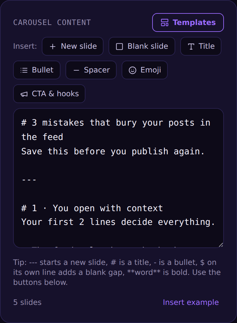
The Content tab is where the carousel is built. A few simple characters control the structure - you can type them yourself or use the Insert buttons above the box (New slide, Blank slide, Title, Bullet, Spacer, Emoji, CTA & hooks).
- →--- (three dashes on their own line) starts a new slide.
- →# at the start of a line is a big heading. Put several # lines on one slide to get several equal-sized headlines stacked together - they shrink automatically so they always fit.
- →- (a dash) is a bullet point.
- →$ on its own line adds a blank vertical gap - handy between a checklist and following text.
- →Select text and use the Format toolbar for **bold**, *italic*, ~~strikethrough~~, ==highlight== and ::accent-coloured:: words - or type the markers by hand. The accent colour sits right there in the Content tab, next to the Format buttons.
2. Choose a layout per slide (Slide tab)
Everything that affects a single slide lives in the Slide tab - and a purple "Slide N" header reminds you these settings only touch the slide you're on. Start with the layout; each slide can use a different one:
- →Standard - title plus bullets or paragraphs, the everyday workhorse.
- →Hero - one large centered title for covers and statements.
- →Big number - a giant number or word, great for stats and steps.
- →Quote - a centered pull-quote with quotation mark.
- →Checklist, Numbered and Steps - lists rendered as checkmarks, numbered circles, or a connected step sequence.
- →Accent bar, Card and Caption - styled frames for emphasis or a caption-style cover.
- →Image right / left / top / bottom - put your photo in one half of the slide and the text in the other, for product shots and screenshots.
- →Two columns - split the text into a side-by-side comparison with // on its own line, ideal for before/after and X-vs-Y.
The layout picker is grouped (Basic, Lists, Styled, With image, Compare) and each option shows a little preview icon, so it's easy to see what you're choosing before you click.
3. Alignment and text size
Still in the Slide tab, set alignment (Left, Center, Right) and text size. Sizes range from XS to XXL, so you can make a punchy cover huge or fit a denser slide comfortably. Size and alignment apply to that slide only, so different slides can feel different while staying on-brand.
4. Shapes and elements
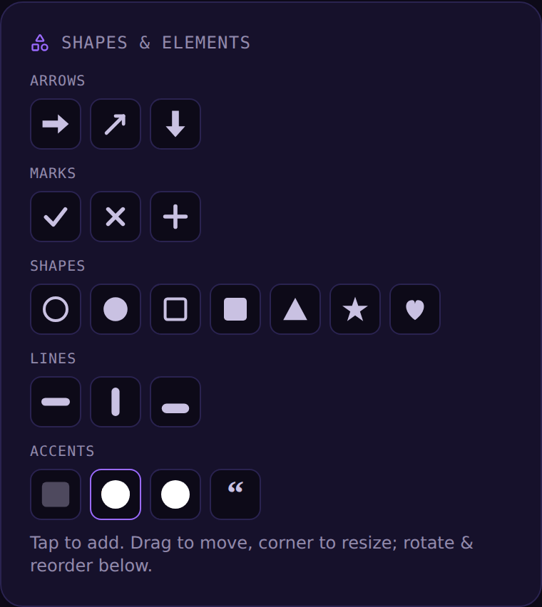
The Slide tab also has a small set of ready-made shapes - arrows, checkmarks and crosses, circles and squares, a star and a heart, dividers and vertical lines, an underline, a highlight bar, a badge, a numbered circle and a quotation mark. Tap one to drop it on the slide, then drag to move it and pull the corner to resize. It's a focused set on purpose: enough to point, mark and emphasise, without turning into a full design tool.
Every shape can take any color - pick one from the theme palette, choose Theme to follow the current carousel color, or open the color picker. Badges and numbered circles also have an editable label.
You can also drop a chart - bar (vertical or horizontal), pie, donut or line. Type your data or paste it straight from a spreadsheet, then set the colours, sort it, highlight one data point, and choose whether to show raw values or percentages. Pie and donut charts get a labelled legend automatically, so people can tell the slices apart.
5. Layering and free rotation
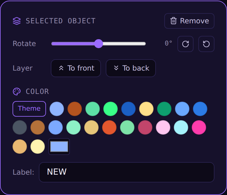
Any object you place - photos and shapes alike - can be layered and rotated. Select it and the Selected object panel appears: drag the Rotation slider to any angle (not just 90 degrees), and use To front / To back to decide which object sits on top of which. That's how you stack two photos, tuck a shape behind your title, or tilt an arrow to point exactly where you want.
6. Themes - whole carousel or per slide (Design tab)
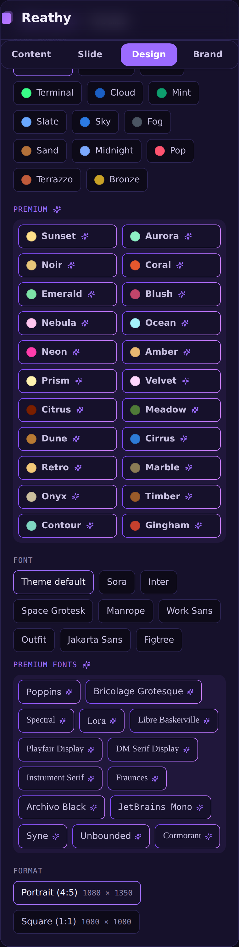
The Design tab controls colors, background and typography. Above the palette there's a toggle: Whole carousel applies a theme to every slide at once, while This slide overrides just the slide you're on (with a one-click reset back to the carousel theme). Base themes are free; premium themes are marked and unlock with Pro. You can also pick from dozens of fonts and set the format (portrait or square) - free users can preview premium themes and fonts in the editor and upgrade to export them.
7. Add images
Images are a Pro feature, in the Slide tab. Each slide can have one background image (with position, zoom, darken, plus rotate, flip and a full crop box) and up to three inline images you can drag to place and resize - and, like shapes, rotate to any angle and re-layer. Tap an inline thumbnail to select it, then rotate, flip, crop or remove it.
Note: photos aren't stored in the saved project yet (shapes are). They stay fully visible in the editor and in your PDF/PNG exports, and when you save a project that contains photos you'll see a note that it was saved without them. This is a temporary limitation while image storage is finished.
8. CTA buttons (pills)
You can drop pill-shaped call-to-action buttons onto any slide - up to seven per slide. Use a preset (Save this, Follow for more, Swipe for more, and more) or type your own. New buttons land near the bottom-right corner - the natural spot for a CTA - and you drag to reposition. When a button is selected you can edit its text, change its size with the slider, and pick a style: Solid, Outline, Glass, or No background (text only).
9. Branding and footer (Brand tab)
The Brand tab is where you make every carousel unmistakably yours. Add your name and handle, and toggle the avatar, page numbers and the "Swipe →" cue on the cover. Pro unlocks a custom brand color, a logo in place of your initials, and a Brand Kit - save your name, handle, logo, color and font once and apply them to any carousel in a click.
10. Manage slides: reorder, duplicate, delete
Under the preview is the slide navigator - a strip of thumbnails for every slide. Click one to jump to it, drag a thumbnail to reorder, or use its ⋯ menu to duplicate, delete, or move it earlier or later. The + tile adds a new slide. Above it, an "Editing slide N" badge always tells you which slide you're on, and Undo / Redo (Ctrl/Cmd+Z and Shift+Z) plus Duplicate (Ctrl/Cmd+D) sit just below. A Compact / Large toggle above the preview lets you work at a smaller size or blow the slide up to check the details - and it remembers your choice.

11. Export and post
When it's ready, export in one click: Download PDF (whole carousel) gives you the multi-page PDF LinkedIn wants, All slides as PNG (ZIP) gives you every slide as a PNG image, and PNG (current slide) exports just the slide you're viewing. To post on LinkedIn, start a post, choose "Add a document," upload the PDF, give it a short title, and publish.
12. Free vs Pro, and saving your work
On the free plan you get up to 5 slides per carousel and 20 exports per month, with a small watermark and base themes and fonts. Pro removes the watermark and the export limit, unlocks premium themes and fonts, images, brand color, logo and the Brand Kit, and lets you keep a library of named projects (up to 50). Every carousel can have at most 40 slides - a hard cap that applies to everyone, free and Pro, so the editor and exports stay fast. Use Save to store the current carousel, New to start fresh, and Open to reopen a saved project. Your latest work is also kept in your browser so it survives a refresh.
That's the whole tool. The fastest way to learn it is to open the editor, paste a few lines of text, and watch the preview update as you add ---, #, and a theme. You'll have a finished carousel in a few minutes.
Frequently asked questions
Is Reathy free to use?
Yes. You can build and export carousels for free - up to 5 slides per carousel and 20 exports a month, with base themes and fonts and no account needed to try. Pro removes the watermark and unlocks premium themes, images, brand kit and saved projects.
Do I need design skills to use Reathy?
No. You write your slides as plain text and Reathy designs every slide for you - consistent type, spacing and color. If you can write a list, you can make a carousel.
What can I export from Reathy?
The whole carousel as a single PDF (the LinkedIn document-post format), any single slide as a PNG, or every slide as PNGs in a ZIP for Instagram and X.
Can I add charts to a carousel in Reathy?
Yes. Drop a bar (vertical or horizontal), pie, donut or line chart on any slide, type your data or paste it from a spreadsheet, and set the colours, sorting, a highlighted data point and whether to show values or percentages. Pie and donut charts get a labelled legend automatically.
How do I format text - bold, highlight, italic?
Select the words and use the Format toolbar in the Content tab for bold, italic, strikethrough, highlight and accent-coloured text, or type the markers directly (**bold**, *italic*, ~~strike~~, ==highlight==, ::accent::). The accent colour is set right next to those buttons.
Can I put an image next to the text instead of behind it?
Yes. The Image-right, Image-left, Image-top and Image-bottom layouts place your photo in one half of the slide with the text in the other - good for product shots and screenshots. There's also a Two-columns layout for side-by-side comparisons.
Make your carousel now
Free to start - 5 slides per carousel and 20 exports a month. No design skills needed.
Open the editor