What to Write in the LinkedIn Post Around Your Carousel
Your carousel is the PDF - the caption is what makes anyone open it. How to write the first line, the body and the CTA of a LinkedIn carousel post, how long it should be, and whether to use hashtags.
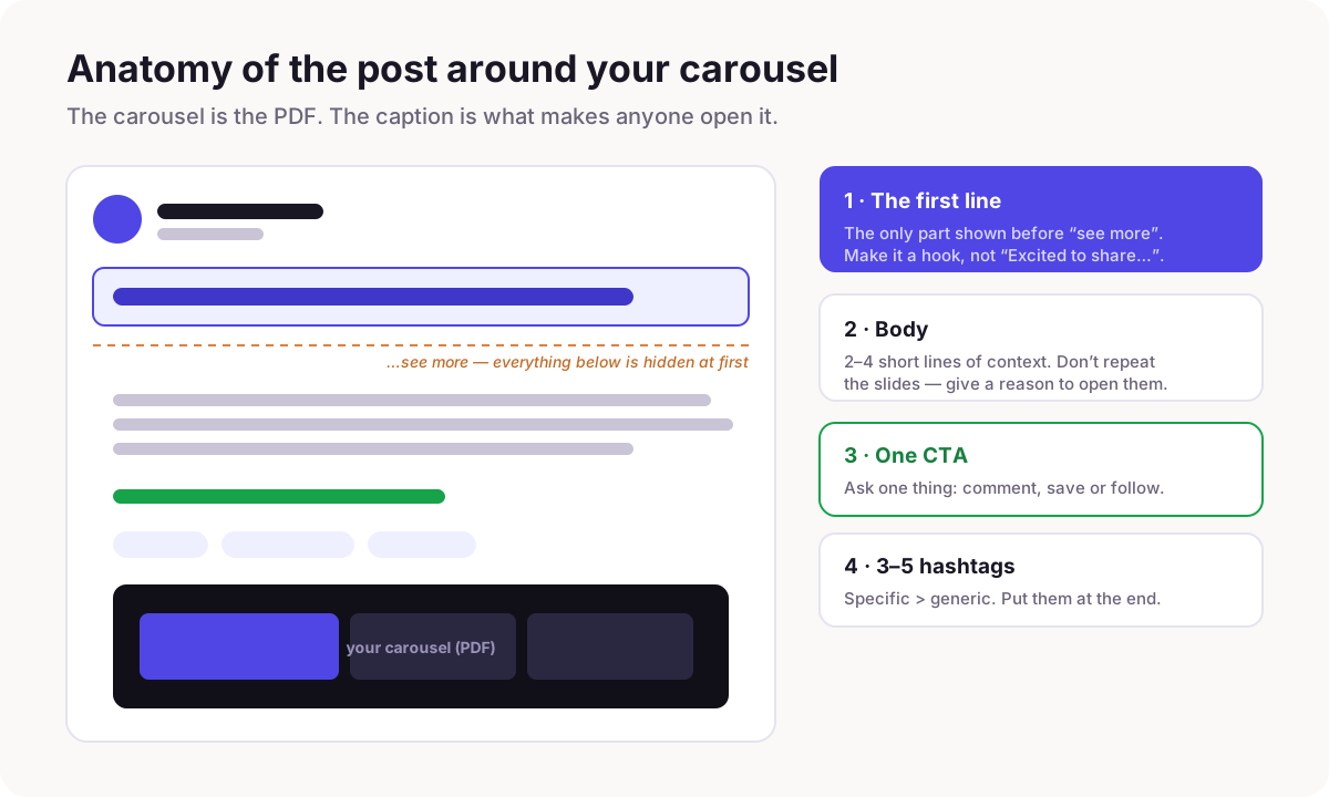
Write the post in three parts: a first line that hooks (it is the only text shown before "see more"), two to four short lines that give a reason to open the carousel without repeating it, and one clear call to action. Add three to five specific hashtags at the end. The carousel does the teaching; the caption's only job is to get it opened.
People obsess over the slides and then paste "Excited to share my thoughts" above them. That is a wasted hook. On LinkedIn the carousel is an attachment - a PDF document post - and the text you write above it is what actually appears in the feed. If that text does not earn a tap, nobody ever sees slide one.
The good news: the caption is short and follows a simple shape. Here is what goes in it and why.
The first line is the whole game
LinkedIn truncates the post after roughly the first line or two, hiding the rest behind "see more." So the first line is not an intro - it is the hook, exactly like the carousel cover. Lead with the specific promise, the surprising claim, or the tension. "I reviewed 40 carousels last month. The ones that flopped shared one habit." beats "Here's my latest carousel on hooks."
Never spend the first line on "Excited to announce," a greeting, or a summary of what the carousel is. Those are the words most likely to lose the tap. If you are stuck, the same hook formulas that work on covers work here.
A structure that works every time
Once the first line has earned the tap, the rest of the caption has a simple job: give a reason to swipe, then ask for one thing. This three-part shape works for almost any carousel:
- →Hook (line 1): the promise or tension. The only line most people read.
- →Context (2-4 short lines): why this matters or what changed - a reason to open the carousel, not a summary of it.
- →CTA (1 line): ask for exactly one thing - a comment, a save, or a follow.
Don't repeat the carousel in the caption
The most common mistake after a weak first line is retyping the slides in the caption. If the caption already tells the whole story, there is no reason to open the carousel - and the swipe is what LinkedIn rewards. Use the caption to sell the click: hint at the payoff, name who it is for, or share the one-line backstory. Let the slides deliver.
How long should the caption be?
Shorter than you think. With a carousel, the slides carry the depth, so the caption can be three to six lines total. Use real line breaks between thoughts - a wall of text is as off-putting in the caption as it is on a slide. Long captions are for text-only posts; here the PDF is the content.
Hashtags: a few specific ones, at the end
Three to five hashtags is plenty, placed at the end so they do not break the reading flow. Prefer specific tags your niche actually follows over giant generic ones - #LinkedInCarousels or #B2BMarketing will do more than #love or #motivation. They help categorise the post; they are not a growth hack, so do not stuff ten of them.
Before and after
Same carousel, two captions. The difference is entirely in the first line and the restraint.
| Weak | Strong |
|---|---|
| Excited to share my new carousel on LinkedIn hooks! I spent a lot of time on this one and I hope you find it useful. Swipe through and let me know what you think. #linkedin #marketing #content #growth #tips #socialmedia | I reviewed 40 LinkedIn carousels last month. The flops all shared one habit: the cover described the topic instead of promising a payoff. The 6 covers that worked are in the carousel - which one would you steal? #LinkedInCarousels #B2BMarketing #ContentCreation |
Common caption mistakes
- →Opening with "Excited to share..." - it buries the hook below "see more."
- →Retyping the whole carousel, so there is no reason to open it.
- →A wall of text with no line breaks.
- →Ten generic hashtags. Use three to five specific ones.
- →Asking for a comment, a save, a follow and a website click all at once. Ask for one.
Make the carousel, then the caption is easy
A sharp caption is much easier to write once the carousel has a clear promise - the first line is usually just the cover hook, rephrased for the feed. Build the carousel first, then lift its promise into line one.
Frequently asked questions
What should I write in the post when I share a LinkedIn carousel?
Three parts: a first line that hooks (it is the only text shown before "see more"), two to four short lines of context that give a reason to open the carousel without repeating it, and one clear call to action. Add three to five specific hashtags at the end.
How long should a LinkedIn carousel caption be?
Short - roughly three to six lines. The slides carry the depth, so the caption only has to earn the tap and ask for one thing. Use line breaks between thoughts rather than a single block of text.
Should I use hashtags on a LinkedIn carousel post?
Use three to five, at the end of the caption, and prefer specific tags your niche follows over broad generic ones. They help categorise the post but are not a growth lever, so there is no benefit to stuffing more.
Should the caption repeat what's in the carousel?
No. If the caption tells the whole story, there is no reason to open the carousel - and the swipe is what the format rewards. Use the caption to sell the click: hint at the payoff and who it is for, then let the slides deliver it.
Make your carousel now
Free to start - 5 slides per carousel and 20 exports a month. No design skills needed.
Open the editor